
Color saturates our everyday environments and quietly shapes how we think, feel, and interact with our surroundings. Home design, in particular, draws much of its emotional character from the colors we choose. Curtains, though often overlooked, can make a dramatic difference to the ambiance of a room. Have you ever noticed how a space feels different when you change the color of its curtains? This article explores the subtle—but powerful—ways solid curtain colors influence mood, atmosphere, and personal well-being at home.
Color psychology suggests that different hues elicit specific emotional responses and alter our perception of space. According to a 2015 review in the journal *Frontiers in Psychology*, color can boost both psychological and physiological reactions in humans. For example, blue tones commonly evoke calmness and increase focus, which is why they're popular for bedrooms and studies. Red, in contrast, is known for igniting excitement and warmth, and is often used to create inviting spaces. Green is linked with balance and restoration, reflecting its association with nature. These color cues aren’t random; they have deep evolutionary and cultural roots.
When designing private spaces like bedrooms or family rooms, color choices become especially significant. These are areas where we seek comfort, relaxation, or inspiration. The curtains you choose can either amplify these effects or work against them, reinforcing or undermining the intended mood of the room.
Curtains aren’t just barriers to light or peeks into privacy; they serve as aesthetic anchors that can set the emotional tone for a room. Solid curtain colors deliver a strong, cohesive chromatic message, affecting both mood and perception in the following ways:
Matching curtain colors to each room’s main function can optimize emotional benefits. For example, soft blue or green in a bedroom encourages calm, while a burst of yellow or red in a workspace can stimulate creativity and motivation.
Across the globe, curtain design reflects both artistic expression and deeper cultural values. In India, curtains are often more than just functional accessories; they are crafted with a strong sense of tradition and symbolism. Indian curtains typically feature bold solid colors, intricate craftsmanship, and natural materials such as cotton, silk, or linen. These elements come together to create an immediate visual statement.
According to interior designer Priya Madan, “Indian curtain styles blend vibrant colors with traditional motifs, offering a sense of warmth and hospitality that’s deeply rooted in our culture.” The use of rich reds, golden yellows, or vivid blues in Indian homes not only enhances aesthetics but also channels centuries of color symbolism. Incorporating such curtains can add meaning and personality to a space, marrying color psychology with cross-cultural inspiration.
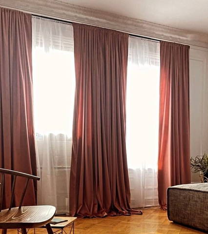
Curtains greatly affect how we experience a room by controlling not just color, but also the amount and quality of light. Solid-colored curtains can amplify natural sunlight or, conversely, create a cozy evening ambiance. The choice between sheer, lightweight fabrics and heavy, opaque materials also impacts a room’s mood.
For instance, airy, light-colored curtains can make a room feel spacious and refreshing, increasing a sense of openness. In contrast, richly colored, dense fabrics can add intimacy and drama, ideal for creating a cozy retreat. The saturation of the chosen color—how vivid or muted it appears—can further heighten or soften these effects. It is crucial to consider both the hue and how the curtain filters daylight when choosing the right fit for your space.
Curtains present a unique opportunity to inject energy and individuality into your home. Bold colors can act as focal points, reflecting your personality and setting the emotional tone for the entire room. To select the right curtain shade, consider these tips:
Test color swatches or use virtual design tools to preview how new curtains will transform your space. For those interested in digging deeper, resources like “Color Design Workbook” by AdamsMorioka and articles in *Architectural Digest* offer practical advice and inspiration.
This material was prepared with the support of the website https://playplinko.org/.